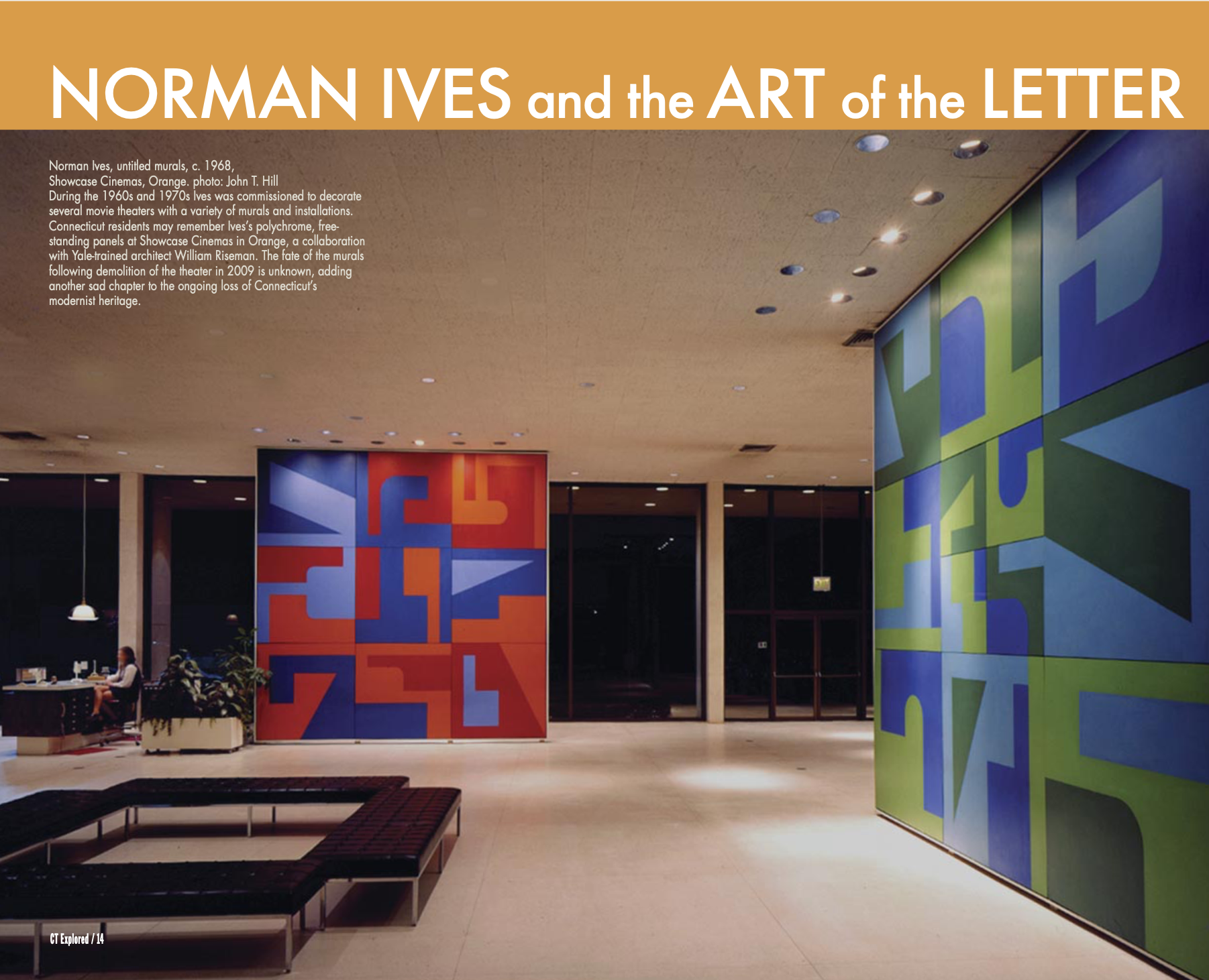
Norman Ives, untitled murals, c. 1968, Showcase Cinemas, Orange. photo: John T. Hill. During the 1960s and 1970s Ives was commissioned to decorate several movie theaters with a variety of murals and installations. Connecticut residents may remember Ives’s polychrome, free-standing panels at Showcase Cinemas in Orange, a collaboration with Yale-trained architect William Riseman. The fate of the murals following demolition of the theater in 2009 is unknown, adding another sad chapter to the ongoing loss of Connecticut’s modernist heritage.
By Charles T. Clark
(c) Connecticut Explored Inc. Winter 2020-2021
All images courtesy Norman S. Ives Foundation unless otherwise indicated.
Subscribe/Buy the Issue!
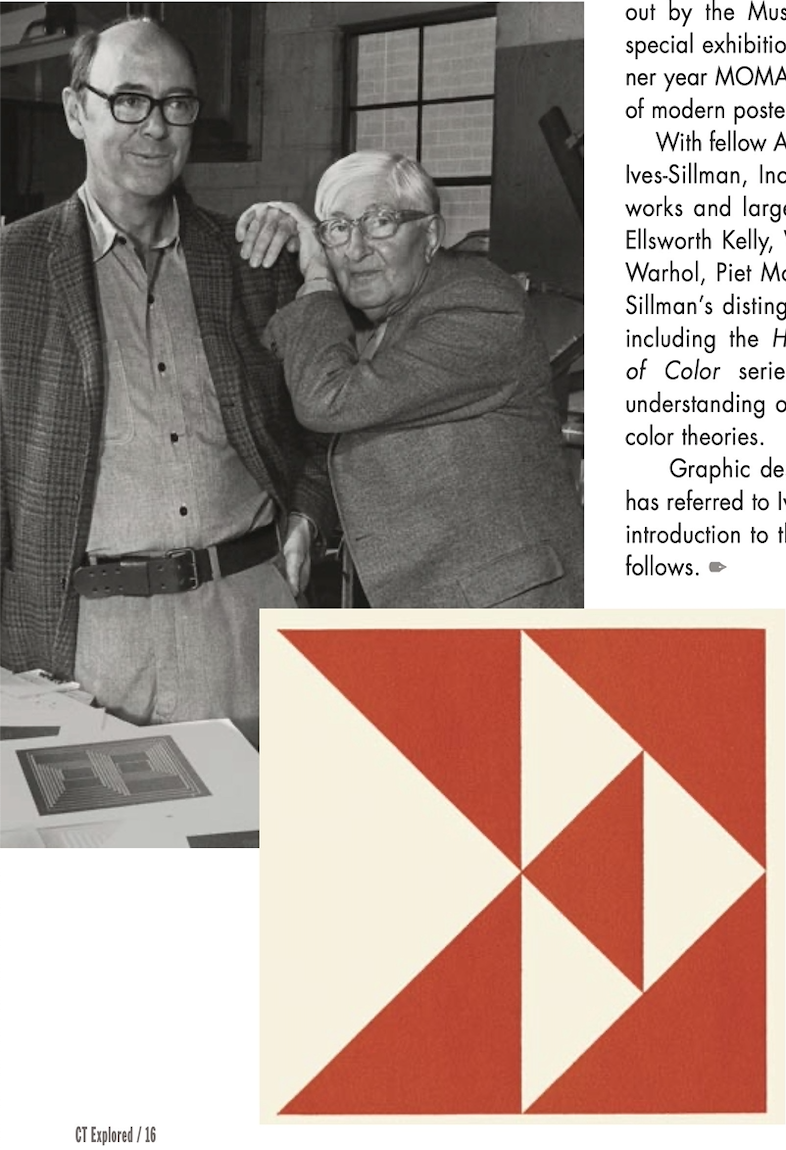
Norman Ives’s abbreviated but distinguished career was set in motion when he enrolled in Yale University’s new graduate program of graphic design in the fall of 1950. His studies, with former Bauhaus Master Josef Albers and Albers’s key appointees Alvin Lustig and Herbert Matter, were so successful that Ives joined the faculty after he graduated in 1952. Ives remained at Yale until his death at age 54 in 1978. Throughout his tenure he worked closely with Albers, Yale’s team of design visionaries, and hundreds of students. [See “Josef & Anni Albers in Connecticut,” Winter 2018-2019.]
Ives is the subject of Norman Ives: Constructions and Reconstructions (powerHouse Books and The Norman S. Ives Foundation, 2020), a new, illustrated biography by photographer, designer, and author John T. Hill. For the first time Ives’s life work is examined in detail, including early portraits, interiors, and geometric compositions inspired by Albers’s examples. As Hill explains, Ives’s principal preoccupation during his mature years was the many ways in which closely cropped typefaces—the very building blocks of printed communication—could be assembled and arranged, often contained within a grid and yielding a variety of effects.
Ives’s versatility revealed itself in a life of experimentation in different fields and media. Revered as a teacher, he also designed corporate logos, book jackets, posters, museum catalogues, postage stamps, and public murals. His private work included prints, paintings, collages, bas reliefs, and free-standing sculpture. In true Bauhaus spirit, he considered his graphic work and fine art indistinguishable in terms of overall merit.
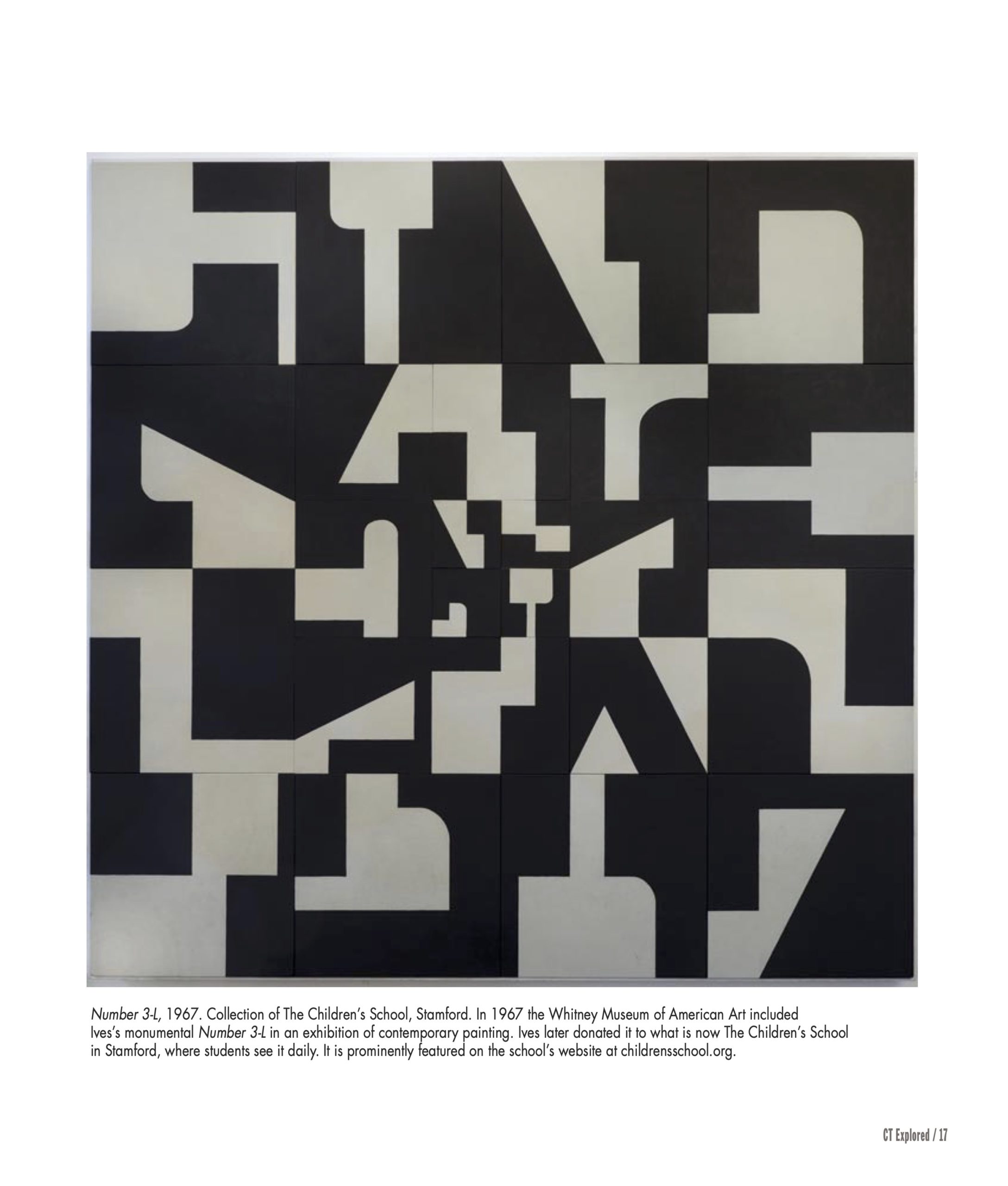
Ives exhibited in New York City at the Stable Gallery, Sidney Janis Gallery, Brooke Alexander Gallery, and others. His eight-foot square painting Number 3-L appeared in the Whitney Museum of American Art 1967 Annual Exhibition of Contemporary American Painting. Also in that year he and two contemporaries were singled out by the Museum of Modern Art (MOMA) for the special exhibition Three Graphic Designers. In that banner year MOMA also included his work in an exhibition of modern posters.
Graphic design historian and author Steven Heller has referred to Ives as a “master of modernism.” A brief introduction to this master’s astonishing range of works follows.
Charles T. Clark has been writing about Connecticut art, architecture, and culture since 1978. He last wrote “Stonington: James Merrill’s House,” Summer 2016.
(top) Norman Ives and Josef Albers, North Haven, 1972. photo: John T. Hill. (below) Norman Ives, Eastern Press Logo, 1958.
Norman Ives and Josef Albers, North Haven, 1972. photo: John T. Hill
John Hill’s remarkable double portrait captures the intimate bond between Albers and his student. Through his book designs and the work of Ives-Sillman printing company, Ives became an important proponent for Albers’s graphic work—in particular through production of the landmark portfolios and individual prints but also through design of several books devoted to Albers’s work.
Norman Ives, Eastern Press Logo, 1958.
According to John Hill, Ives was employed by New Haven’s Eastern Press in the 1950s, thereby suggesting this striking corporate logo was commissioned prior to its publication in Ives’s landmark 1960 book 8 Symbols (printed by Hiram Ash at the Yale School of Art and Architecture). With a foreword by Albers, the book proposed a series of corporate logos based on simple geometric patterns or stylized typefaces. This example was used as a corporate logo on Eastern Press’s headquarters building, in advertising, on letterhead, and on delivery trucks. It was so influential it was later adapted by other designers for their own corporate clients.
Norman Ives, Number 3-L, 1967. Collection of The Children’s School, Stamford. Courtesy of the Norman S. Ives Foundation
Number 3-L, 1967. Collection of The Children’s School, Stamford
In 1967 the Whitney Museum of American Art included Ives’s monumental Number 3-L in an exhibition of contemporary painting. Ives later donated it to what is now The Children’s School in Stamford where students see it daily. It is prominently featured on the school’s website at childrensschool.org.
Norman Ives, Number 2, 1967, screen print, 1967. Courtesy of the Norman S. Ives Foundation
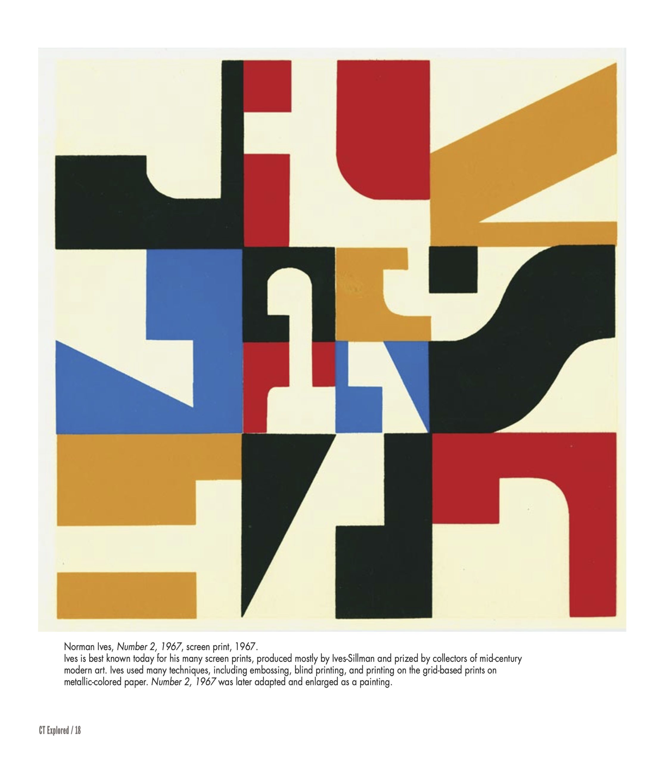
Norman Ives, Number 2, 1967, screen print, 1967.
Ives is best known today for his many screen prints, produced mostly by Ives-Sillman and prized by collectors of mid-century modern art. Ives used many techniques, including embossing, blind printing, and printing on the grid-based prints on metallic-colored paper. Number 2, 1967 was later adapted and enlarged as a painting.
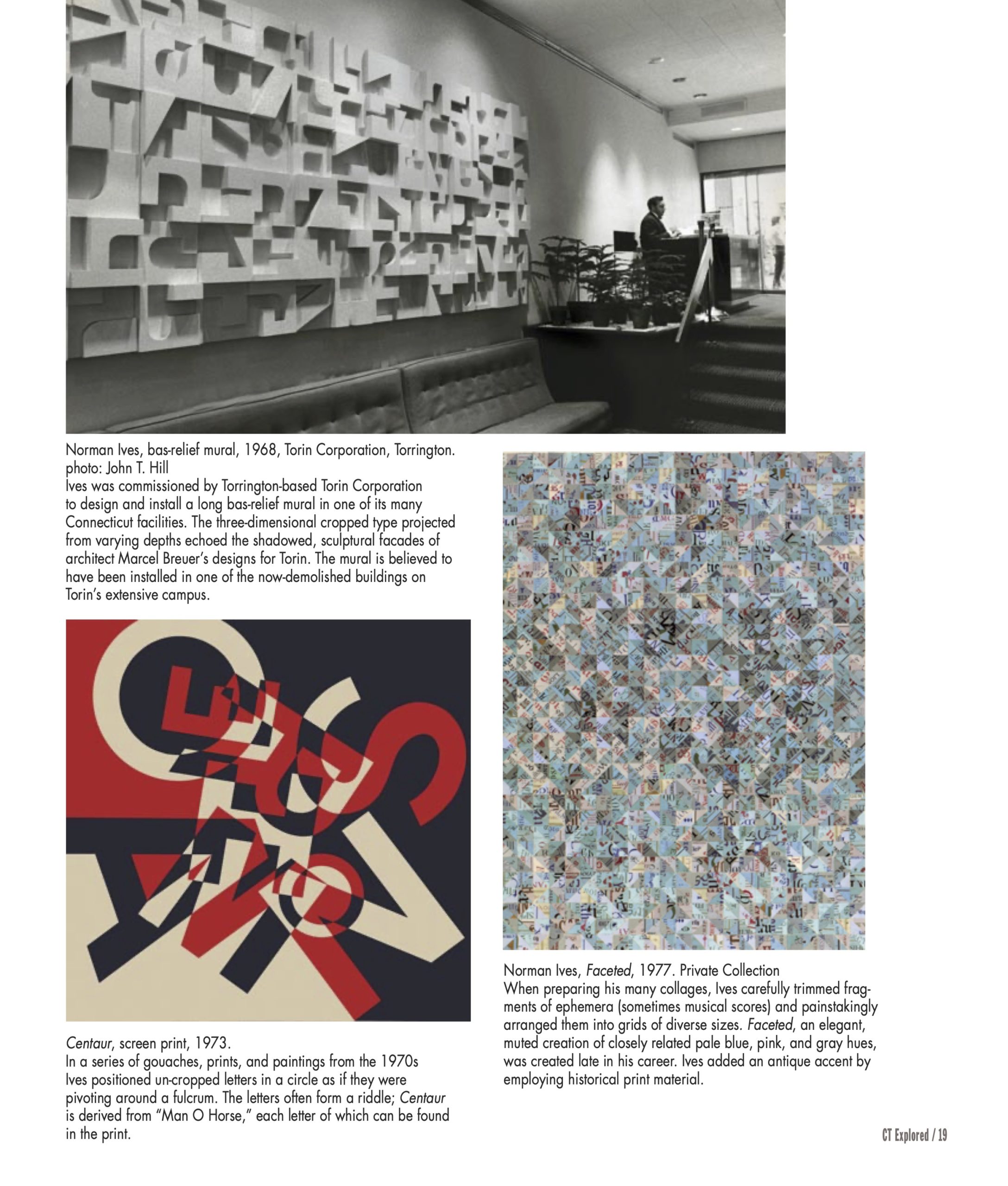
(top) Norman Ives, bas-relief mural, 1968, Torin Corporation, Torrington. photo: John T. Hill. (bottom left) Norman Ives, Centaur, screen print, 1973. (bottom right) Norman Ives, Faceted, 1977, Private Collection. Courtesy of the Norman S. Ives Foundation unless otherwise noted.
Norman Ives, bas-relief mural, 1968, Torin Corporation, Torrington. photo: John T. Hill
Ives was commissioned by Torrington-based Torin Corporation to design and install a long bas-relief mural in one of its many Connecticut facilities. The three-dimensional cropped type projected from varying depths echoed the shadowed, sculptural facades of architect Marcel Breuer’s designs for Torin. The mural is believed to have been installed in one of the now-demolished buildings on Torin’s extensive campus.
Centaur, screen print, 1973.
In a series of gouaches, prints, and paintings from the 1970s Ives positioned un-cropped letters in a circle as if they were pivoting around a fulcrum. The letters often form a riddle; Centaur is derived from “Man O Horse,” each letter of which can be found in the print.
Norman Ives, Faceted, 1977. Private Collection
When preparing his many collages, Ives carefully trimmed fragments of ephemera (sometimes musical scores) and painstakingly arranged them into grids of diverse sizes. Faceted, an elegant, muted creation of closely related pale blue, pink, and gray hues, was created late in his career. Ives added an antique accent by employing historical print material.
Subscribe to receive every issue!
GO TO NEXT STORY
GO BACK TO Winter 2020-2021
Explore!
Read more stories about Modernism in Connecticut on our TOPICS page
Read more stories about Connecticut’s Art History on our TOPICS page